Over the weekend I updated SkillsLibrary to use the newer version of Bootstrap from Twitter. You can see the new version which is running on AppHarbour (which I’m using as my UAT environment) http://skillslibrary.apphb.com/ and compare it to the older version running in production: http://skillslibrary.net/.
Bootstrap V2 is going to be released on 31st Jan. 2012 and you can read about the changes from the official source here.
In this article I’ll go through some of my own personal experience in terms of upgrading.
Configurable Download
From the outset, the Bootstrap team have improved the deployment of this resource by allowing you to configure your download and receive it as two single CSS and JS files.
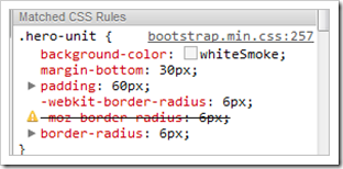
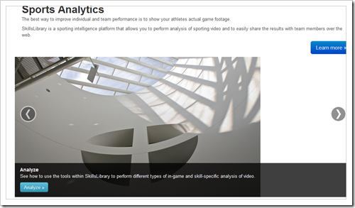
The first thing to notice as an unauthenticated user is that I’ve removed the “Hero Unit” from the home page and replaced it with smaller title text and a carousel of images. Part of the reason for that change was that, the previous version of Bootstrap had a Hero Unit CSS class which has not been carried forward:
Home Page Carousel
Another reason was that I had always planned to implement a carousel of images and now that it’s a core component in Bootstrap, it seemed like a good time to make that change:
Most of the other changes are not visible until you log in although there were some other smaller tweaks that I had to make across the site to accommodate the new base styles.
Re-styled Forms
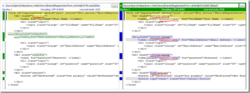
The most significant site-wide change involved updating the layout of forms and their controls to match the new V2 component styling. Forms in V1 were really nice but the semantics have been significantly improved in V2. The following image highlights some of the differences that I made to upgrade the Registration form:
You can see that the rows in the form have had their class name changed from clearfix to the more semantically sensible name of control-group. Likewise, the area at the bottom of the form has changed from actions to form-actions and labels now have a class name to distinguish them. There were other changes as well, but these were the ones that I had to make to all of my forms.
Navigation
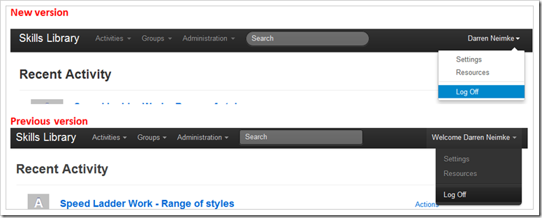
When you log in to the application, there are lots of changes that become apparent, starting with the Global Navbar. The following image compares the previous version with the current one:
From a purely visual perspective, you can see that the Search box has altered to display more rounded corners and that the dropdown menu’s have received a significant upgrade to their appearance. But the HTML semantics have also changed but have remained very simple.
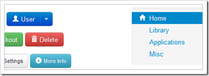
One thing that I have not yet implemented as yet, but which I will definitely be doing is to make use of the sprite images that have been bundled with Bootstrap to make my menu’s and buttons look much snazzier! Using those sprite images makes it easy to achieve results such as this with the ‘out of the box’ experience:
Split Button Dropdowns
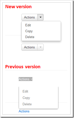
A key improvement for SkillsLibrary was the introduction of the new Button Dropdowns which have been introduced. Prior to these I had hacked together a rough user experience for performing additional actions against Activities by using the V1 dropdowns but now they have bundled them to create a beautiful Split Button Dropdown experience:
It’s lots of little things such as this which have really tightened up the user interface a lot.
Dialogs
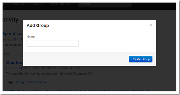
Probably the other major UX feature that I implemented was the Modal Dialogs.
These existed in the V1 version of Bootstrap but have again been improved to include enhancements such as dark background when the modal is displayed and cleaner styling and semantic HTML options for closing the dialogs.
Other
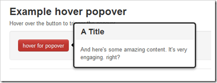
There were several other smaller changes to styles and HTML syntax. Some of the component class names changed and other components have had improved UI. One of these was the popover controls which now make it easier to display a prominent title and description text as a single component.
Conclusion
SkillsLibrary is a moderately complex web application with about 30-40 pages. All up, it took me about 4 hours to upgrade from V1 to V2 of Bootstrap. Having done so I feel very satisfied that the UX improvements that I’ve discussed in this article have made it worthwhile but I also feel happy that implementing further components (such as the Typeahead and Collapse) controls will allow me to reduce my overall 3rd party JS dependencies.
Hey.. i implementing.. Split button dropdowns
ReplyDeleteits not working..
Do i need add any support js.. other than.
script src="js/bootstrap-tab.js" script
and inline script to activate..i can't see in docs.. How to use in when its come to script ??
Hi @jesu4u, I'm not actually sure how the components map to individual script files. I actually just downloaded everything in a single file - you can do that by checking everything on the following custom configuration page:
ReplyDeletehttp://twitter.github.com/bootstrap/download.html