Download the code for this article:
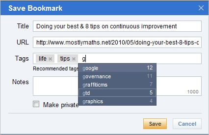
The metaphor for tagging data has become ubiquitous on the web and is now one of the most common ways of allowing users to categorize information. Once information is tagged, those tags are consumed in a variety of ways including search, tag clouds, and flat lists of tags. Of all the web sites that I've used, the one that does tagging the best in my opinion is Delicious. The following image shows entry field for entering tags when adding a new link on Delicious:
In this article I will show you how to create a similar data entry experience to this using ASP.NET MVC and the jQuery.UI autocomplete component. The features of our entry field will be as follows:
As you can see in the above image, the user can type to get an autocomplete listing of tags, and then click to select from the autocomplete list. There's a couple of little tricks at play here which are:

- The appearance of the input box seems to indicate that images of selected tags are held inside the input box that is used to type into.
- The autocomplete listing itself.
First things first, let's look at how to create the appearance that selected tags are being stored within the text box. What's going on here is that, what appears to be an input field, is actually just an outer Div element with a gray border. Held inside of that Div element is an unordered list which, in the case of the "People" tag entry field shown above, contains the following structure:
<div id="tagInputContainer">
  <ul>
    <li><em class="tagName">Bjorn Borg</em><span class="rm"></span></li>
<li><em class="tagName">Boris Becker</em><span class="rm"></span></li><li id="tagInputListItem"><input class="tagInput" id="tagInput" /></li> </ul> </div>
He we can see that the actual input element is the last child of an unordered list which is held within a Div. What happens is that, as the user selects another tag, a new list item is dynamically inserted into the unordered list at an index position immediately before the list item which contains the input element. The rest of the illusion is achieved through the magic of CSS.
The jQuery for the node insertion is relatively straightforward. We handle an event, and then insert a new list element immediately before the element with the id of 'tagInputListItem' like so:
The jQuery for the node insertion is relatively straightforward. We handle an event, and then insert a new list element immediately before the element with the id of 'tagInputListItem' like so:
$('#tagInputListItem').before(
'<li class="tag" id="container_' + ui.item.value + '"><a><em class="tagName">' + ui.item.name + '</em><span class="rm" id="' + ui.item.value + '"></span></a></li>'
);
You can see that there are some dynamic values being created for the id of the list item and the id of the span that hosts the remove icon and also for the em data. We will get to this shortly and explain what ui.item actually is when we discuss how to create the autocomplete functionality. For now, let's finish going through our layout template for the tag entry field.
When the user clicks on the span with the class of 'rm', we will want to remove the entire list item that contains it from the DOM. Again, this is easily accomplished with some relatively simple jQuery code:
Implementing Autocomplete with jQuery.UI
Now that the structure for our user interface is understood, let's look at how to implement the autocomplete behavior using the jQuery.UI autocomplete component. In this example, we will create a client side array of data as the source of our lookup data, but using the jQuery.UI component, it is just as simple to do Ajax-style lookups dynamically from the server if you have lots of data. In this example, lets create a small array of objects to store our data like so:
The idea is that when the user types into the text box, it will look up the names of entries in this list, and return any matches. In our HTML above, the input element that we want to add autocomplete behavior to has an ID of 'tagInput', and so we bind the jQuery component to that element using the following syntax:
The properties are pretty straightforward and are well explained documentation on the jQuery.UI web site. I will briefly explain what's happening in our event handling code though.
That's pretty much it. The remainder of the solution involves creating the CSS styles to make the control work visually. At the top of this article is a link to a working example of the solution which contains an actual working stylesheet, but the most important visual tricks to implement are:
Other useful related articles:
When the user clicks on the span with the class of 'rm', we will want to remove the entire list item that contains it from the DOM. Again, this is easily accomplished with some relatively simple jQuery code:
$('#tagInputContainer).click(function (event) {
    if ($(event.target).is('span')) {
        $('#container_' + event.target.id).remove();
    }
});Implementing Autocomplete with jQuery.UI
Now that the structure for our user interface is understood, let's look at how to implement the autocomplete behavior using the jQuery.UI autocomplete component. In this example, we will create a client side array of data as the source of our lookup data, but using the jQuery.UI component, it is just as simple to do Ajax-style lookups dynamically from the server if you have lots of data. In this example, lets create a small array of objects to store our data like so:
var peopleDb = [
    { value: "Andre_Agassi", name: "Andre Agassi" },
    { value: "Arthur_Ashe", name: "Arthur Ashe" },
    { value: "Boris_Becker", name: "Boris Becker" },
    { value: "Bjorn_Borg", name: "Björn Borg" },
    { value: "Kent_Carlsson", name: "Kent Carlsson" },
    { value: "Pat_Cash", name: "Pat Cash" },
    { value: "Jimmy_Connors", name: "Jimmy Connors" }
];
The idea is that when the user types into the text box, it will look up the names of entries in this list, and return any matches. In our HTML above, the input element that we want to add autocomplete behavior to has an ID of 'tagInput', and so we bind the jQuery component to that element using the following syntax:
$("#tagInput").autocomplete({

    minLength: 0,
    source: peopleDb,

    focus: function (event, ui) {
        $("#tagInput").val(ui.item.name);
        return false;
    },

    select: function (event, ui) {
        $('#tagInputListItem').before(
            '<li class="newTagItem" id="container_' + ui.item.value + '"><a><em class="tagName">' + ui.item.name + '</em><span class="rm" id="' + ui.item.value + '"></span></a></li>'
        );
    },

    close: function (event, ui) {
        $("#tagInput").val("");
    },

    width: 200
});- Added the .autocomplete behaviour to the #tagInput element
- Configured the following properties of the autocomplete component: minLength, source, width
- Bound to the following events of the autocomplete component: focus, select, and close
The properties are pretty straightforward and are well explained documentation on the jQuery.UI web site. I will briefly explain what's happening in our event handling code though.
- Focus: The focus event fires when the user places their cursor over an item in the autocomplete list. We are simply taking this value and displaying it in the text box to indicate the possible selection value.
- Select: The select event fires when an item is selected from the autocomplete list. In our handling code, we are taking the value of the selected item (ui.item.value and ui.item.name) and using them to inject a new list item into the list, immediately before the node with an ID of 'tagListInputItem'.
- Close: The close event fires whenever the autocomplete list is closed; this happens either when the user moves their mouse away from the list, or when they have selected an item from it. At this time we are simply removing the value from the text box to indicate that there is no data waiting to be selected.
That's pretty much it. The remainder of the solution involves creating the CSS styles to make the control work visually. At the top of this article is a link to a working example of the solution which contains an actual working stylesheet, but the most important visual tricks to implement are:
- Remove the border color from the input element so that it is not visible
- Add a border color to the outer DIV element to give the appearance that it is an input element
- Add an image to the SPAN element so that it looks like a close button
- Style the tag list items so they look like tags
Enjoy!
THNX JUST THING I WAS LOOKING ,,
ReplyDeleteHAS ANYONE IMPLEMENTED THIS ..
NEED A GOOD TUTORIAL CAN YOU SUGGEST SOME FOR BEGINNER ..
from where can i download the source code?
ReplyDeletefrom where can i download the source code?
ReplyDelete